Thursday, September 15, 2011

Nothing (but flowers)


Entering Benedict Ernst’s Nothing (but flowers) exhibition at West Space is like entering a grand hotel with light streaming through the windows, glossy parquetry floors and Ernst’s striking sculptures of flower arrangements. These works draw upon the elegant configurations of contemporary floristry but are constructed using the found objects one would more commonly associate with household junk. There are bouquet’s made of broken beer bottles, saucepan lids, hose pipes, wire, busted car tires, bottle tops and sushi soy fish lids. However, there is a sense that this is more than just an exercise in aesthetic reconfiguration—sculpting in junk. Ernst plays on a notion of the bouquet of flowers as an object that is universally recognised and understood. 


In his ability to arrange sharp nails, scrubbing brushes and tennis balls as beautifully as a bouquet, Ernst raises the question—why do we love flowers? In rites of passage they are symbolic of a life cycle. Like the brides, lovers, mothers and grievers they are given to; they embody the blooming and withering and blooming and withering of life. The language of flowers, picked up in the florist slogans “more than words” and “say it with flowers”, makes flowers unlike any other inanimate objects, except maybe art. They are used to symbolise the abstract emotions that people have trouble expressing. 

The title of the exhibition Nothing (but flowers) suggests a certain empty sentimentality that can be bought too easily with flowers. They can convey too much for too little. Though Ernst’s work is made of “nothing”, the items in a household we would generally ignore, the detail and ingenuity of his work make them so much more than the average bouquet. Like the ephemeral symbolism of living flowers, these bits of junk that have been transformed—have had life and death. While a bouquet of nails and screws may seem more confronting and hostile then velvety rose petals, Ernst works asks us to consider what sort of messages underlie the emotionally loaded bunch of flowers. In his catalogue essay Ernst repeatedly apologises for his project. Ernst has accentuated certain sharp, angular and prickly features of flowers to suggest a subtext of ambivalence. 


Ernst likens his work to ‘a “gift” your cat drags in from the night, still beating with feathers and blood to your bedroom pillow’. Receiving flowers, though never admitted, may often be like the gift from the cat. It is a way of unloading something on someone; it asks the receiver to recognise, accept and be grateful for an object that symbolises the emotional state of the giver. Much like in all interactions with other people sometimes this is something we are glad to have received—we want to know about, we enjoy it or hope for it. For the giver, the flowers can be used to mask awkward feelings. A clean way of discharging obligations, sometimes by remote, without getting caught up in too much emotional junk. They are a quick solution to unloading a burden, demanding forgiveness, displaying easy care and affection and relieving the anxiety of bearing witness to an uncomfortable pain or sorrow.  


Slavoj Žižek would like Ernst’s flowers. In The Perverts Guide to the Cinema Žižek describes flowers as “disgusting”, like a vagina dentata, that should ‘be forbidden to children’. Many of Ernst’s flowers, like the beer bottle tops with fake eyelash petals, evoke this sort of menacing interpretation of flowers that will lure you in like Venus Fly Traps only to devour you to fulfil their instinctual desires. As symbols of love and affection, flowers that devour seem synonymous with an idea of love as a hunger or yearning that needs to be fed.  It follows that in Žižek’s Enjoy your Symptom, Žižek writes that the lover seeks the beloved to fill a lack in himself. The beloved in order to resist objectification reciprocates with his own lack/desire. Žižek says ‘the two lacks can succeed and beget a new harmony’. The aggressive quality of some of the flowers in Ernst works evokes certain violence in the objectification of the beloved. The “be mine” demand, so liberally sugared in pop songs and Valentine cards, is often read simply as hyperbole for aching desire. In these works the demanding “be mine” sentiment comes at us in a jealous rage with jagged beer bottles and planks of wood. 


The “Nothing” of the title speaks of voids like they are growling stomachs and hollow gestures. These works show there can be duplicity in grand demonstrations of emotions. Maybe we like to unload our feelings of guilt or shame onto others while making it seem like we are doing something nice. Maybe we give a bouquet to force a person to think about us and not just fleetingly, but appreciatively and affectionately for the duration of the week that the flowers last. Sometimes, though, flowers are very nice. Ernst also seems to celebrate flowers through his affectionate studies. I once entertained a quick and silly idea where I would send flowers anonymously to people working in car parks all around the world—to make them happy. A friend advised me of the arrogance and narcissism of my Pollyanna plan. He suggested I would probably end up responsible for at least one car park attendant’s battering from a jealous spouse who refused to believe the flowers were from “nobody”. Ernst work celebrates the intricacies and complexities of the gifts we give. The too-easy statements conveyed with flowers can be used to mask and prettify ambivalent and confronting emotions. 

Monday, August 22, 2011

The Devil had a Daughter

Tony Garifalakis, Cover ups, 2008. Joyce Nissan Collection, Melbourne


This exhibition title, The Devil had a Daughter, sounds like the title of a Gothic novel. The viewer is instantly drawn into a sense of narrative in these works and their relationship with one another. These printed works, under this title, seem to evoke all the devil’s daughters of the printed word in literature. They embody a certain power and sexuality that once awakened becomes a force of chaos or destruction. These are the heroines from literature that leave the reader awed and terrified: Medea who ruthlessly avenges her husband’s abandonment; Lady Macbeth who calls upon the dark forces to help suppress her femininity to help kill the King; Arthur Miller’s Abigail who can destroy a community with her jealous and hysterical witch-pointing finger and Toni Morrison’s Sethe who can kill her daughter Beloved to save her from the life of a slave. The devil is in the ambivalence of their acts. These characters, and many others, have carried a warning to readers to avoid assumptions about what should be considered “natural" for a woman. But there is also an ironic tension in many of the artworks that explores the lines between the bawdy and the obscene, the comic and the tragic. 

Jason Greig’s work contrasts the Romantic sense of metaphysical dark forces that leave characters cursed and powerless with the Humanist stories of Ancient Greece. While the Greek plays were in homage to the Gods, they tend to emphasise the responsibility humans must take for the darkness in their lives. The Romantic motifs in Greigs work include Poe-like hazy shadows with small figures, black cats, full moons and willowy women. However, the dangling little legs in Dragonfly speak of the hubris of Icarus. In Greig’s work Icarus hand glides in a giant old man’s head—literally flying in-the-face of his father’s warnings. There is also the haunting Phaedra in Phaedra Chain. She is bearded like a witch from Macbeth. They are “weird women” who can tell the future and in so saying make it happen. Phaedra is a classic devil’s daughter in her lust for her stepson Hipploytus and her ability to enunciate the destruction of her husband and his son from the grave. Despite the ominous metaphysical elements in this work the real devil comes from a knowledge of something that resides within the characters, hidden, repressed and then unleashed in irrational destructive directions.  

Pat Brassington’s photographs evoke a sense of slithering parasitical intrusion into a beige domestic space. The work titled The Wedding Guest shows a pink and lumpy alien substance emerging from a white embroidered satin—suggesting a seeping surprise for the wedding party. In Rocket the slippery alien tongues at the foot of tight white pants also evoke a secret now revealed. These works carry a sense of the suppressed memory coming out in an unsightly and menacing way, growing, slithering and taking over the family home. In Topography in Pink, the holes in the pink pantyhose in the image of the female crotch are not eroticised but suggest an inanimate mannequin, moth-eaten, claustrophobic and decaying. 

Stuart Ringholt, Circle books, 2005 (detail). Monash University Collection

There are lots of holes in the works of this exhibition. In Stuart Ringholt’s work, holes have been cut into the faces in book illustrations and have been collaged with holes upside down or different eyes or no eyes. The faces become grotesque and disturbing. David Noonan also creates collages with holes that reveal multiple faces or another layer below. In a video, Mike Parr inhales his sketches of his self portrait over his face, momentarily breathing life into these masks. His mouth is the hole we see between sketches. Tony Garifalakis has left holes for a model’s blue eyes or smile behind sinister aerosol blackness. In all these works there is a sense of unpeeling layers that will reveal something dark and incomprehensible. The idea of holes is usually that they are a void; in these works they reveal a disturbing and unexpected presence. Like Blanche Dubois’s secret desires for boys at the Flamingo Hotel or the destructive fires and pistols of Hedda Gabler, these works tell the story of masks of repression breaking down to reveal a grotesque and hungry drives. Part of monstrosity of the revelation of these drives in femininity is the control and disavowal of them in the first place. 

In tragedy, these drives reveal themselves to those who seek to control them the most. In The Bacchae the prudish King Penthius admonishes the women for their debauchery on the mountain but would also very much like to see it—just so he can understand it better, of course. He hides in the bushes and peeks through a costume of fawn skins. The women, including his mother, find him and in their intoxicated state they think he is a lion. They rip his head off and parade it through the town. In Sally Smart’s collage on the wall we seem to crouch down before this sort of large dark female ritual. The figures wear puffy Victorian sleeves, swishing petticoats in flight and swatches of floral corduroy—they are like good girls that are now running through woods and metamorphosing. Some have lost limbs, some have beetle heads or stick heads, the tree shapes are horizontal and yet there is a sense of walls; the forest has come into the house and the girls will never be the same. Like a Penthius in the bushes, the viewer watches these figures with fear, desire and wonder. That they are pasted directly onto the gallery walls rather than contained in a frame confronts viewers’ voyeurism. There is no window-like proscenium arch the viewer can just passively peek through and keep protected from a returned gaze.  

Sally Smart, In Her Nature (Performativities) 2011
synthetic polymer paint, ink and oil pastel on linen and cotton velvet with collage elements
The Devil Had a Daughter, 2011 installation view, photo: Christian Capurro

The eyes and holes where eyes should be throughout this exhibition seem to say a lot about our capacity to thoroughly enjoy watching the unravelling of others—as we do when we read and watch films and theatre. They also ask us to consider how this act of watching, admonishing, critiquing, admiring—reveals our own desires. In Dylan Martorel’s work we literally peep through stereoscopes at intricate patterns at once theatrical floral, celestial, insectal and decorative. We peep into a deep three dimensional interior, as the matching wallpaper work opposite suggests. The neon tubing evokes the penny peep show of the carnival. It is the illicit joy of peeking into what cannot be seen on the surface that is so satisfying. Like in a peep show, in art, literature, theatre and film the audience are offered the opportunity to peer into another world. They experience the emotional catharsis dissociatively, anonymously and without consequences—like a dream.  
 
The drawings of Petrl Herel capture the irreverent humour that runs throughout the exhibition. The figures are little illustrative monsters morphed from wings and genitals. They are like a naughty drawing on a school desk but also finely graphic like an ex-libres printed for an erotica collector. The figures are bulbous and hairy, if they moved they would waddle. These works express a comic element related to the uncanny. Herel’s work acts like the chorus of cheeky satyrs that would follow a Greek tragedy. They would wear long leather phalluses and would perform lots of sexually charged gags similar to burlesque. The lusts and desires that are shockingly revealed in a tragedy are playfully mocked in the comedy. 

The Devil Had a Daughter, 2011, installation view, artists left to right: David Noonan, Tony Garifalarkis, Sally Smart, Jason Greig, Stuart Ringholt photo: Christian Capurro

The artworks in The Devil had a Daughter evoke the anxiety central to the tension in comedy and tragedy. This unpeeling or unravelling is unnerving because it undermines the pretence of control that we like to maintain. The eyes and holes throughout this exhibition act as windows where the viewer both sees and is revealed. Like a witches’ séance, the works conjure the monsters of literature, particularly female characters that stretch our empathy to dark and ambivalent places. Their secrets swell like pus from freshly pierced ears and run like stocking ladders to hem lines. 


Anna Newbold

Monday, August 15, 2011

The writing’s on the wall

"Variations of [minor] nature may have an adverse effect on levels of risk” by Tristan Da Roza


Tristan Da Roza creates a site—a construction site, a demolition site. A site that is bordered, defined, subject to definition and constraint. Literally “Variations of [minor] nature may have an adverse effect on levels of risk” is a site in all this word’s vicissitudes. There is the feeling like we have walked into a world of calculated destruction, perceptual destruction, linguistic destruction and creative destruction. There is a sense that this is an absurd space, like a Borges story of incomplete visions being eternally built and destroyed, rebuilt and discarded. We get the feeling that an earnest architect lost his job or his head on this site. He was telling a joke about a lawyer who walked into a bar.


A black wooden truss arm, similar to a crane boom, is hinged to the gallery wall and extends across the space of the gallery above the viewer’s head. A pendant line, rigged to the ceiling and winched from the wall, holds the structure in a diagonal position. Perspex is clad along the length of the truss arm. C-clamps hold the Perspex in place. The structure is broken. Perspex shards and casement, or frame are caught in the truss lattice. Shattered pieces of wood, brick and Perspex lie on the floor. Another part of the installation, a chunk of cement, into which an eye bolt is drilled, is suspended by rope and pulley, again, from the ceiling. It hangs over a Perspex platform resting on a square outline of glowing neon lights on the floor—it is covered in broken cement pieces. Neon-orange builder’s line marks out borders and delineates a gestalt on the wall—similar to a picture’s edge. Within is a splatter of grey building-site-like mess—just enough to look like an aberration. A flat high-gloss black surface (that looks like a flat screen TV) supported by a truss frame is horizontally hinged to the wall—it swings freely like an unfastened gate. Lines of perspective, in accordance with a point of view in the gallery, are marked in duct tape on the floor. An octagon, stop sign shape made of hi-vis tape outlined on the floor seems to mark an arbitrary safety zone.

There is a road delineator post at the entry to the gallery. This forms a threshold—a symbolic entrance into the space contained by the installation. Words activate this space through a series of abstract and complicated warnings. ‘Variations of a [minor] nature may have a adverse effect on levels of risk’—these words, which are presented as makeshift (with intentional errors) in a plastic pocket stuck to the wall, place the onus on the viewer. ‘Spatial awareness can be prompted by potential risks involved occupation; negotiating risks may be a productive process’—is noted on a sculpture similar to an on-site drafting bench made of shards of broken glass. 


By entering into the installation the viewer has accepted the terms and conditions of the signs. This is much like the “enter at own risk” sign on a building site fence or the “you break it you buy it” sign in a souvenir gift shop. However, the signs in this installation are abstract. Whether or not the viewer understands them has no impact on the consequences of actions and reactions within their obtuse logic. Awareness, risk and productivity poetically coincide in this formal sophism. The elusive content of the signs needn’t be read, understood or even real for their implications to feel consequential within this theatrical installation. The jostle of images in the visual field seems to cause breakage. However, by entering the space, the viewer is aware that they are responsible for the damage (regardless of whether they know it or not). This shattered project, this crushed model Xanadu, will be bigger, better and more modern than originally imagined because the architect is dead; the building permits haven’t been approved; the price of materials has inflated; and there has been a catastrophic shakeup in a snow-dome somewhere. 


Tim

Wednesday, July 27, 2011

Paradise


Brook Andrew’s exhibition Paradise stings of sharp irony from the outset. The work is based around a collection of rare postcards from the past century of indigenous people from a range of countries including Australia. We send postcards when we are on holiday; send them back home to report on the weather, the sights and the curiosities we have found. In these postcards, the indigenous people are objectified as sights seen. In these works, with coloured neon lights behind or around them, there is the sense that the people in these images have been sold - like for a circus or freak show—for a cheap price, for a cheap laugh. They are fetishised, ridiculed and humiliated through the colonial tourist’s gaze. 


The first work we see Union Jack is a black and white postcard of young people performing what seems a traditional ritual—adorned with ceremonial body paint. When we look closer we see the body paint is a Union Jack. A white man in a dark suit is watching the performance. The mark of his gaze is unmistakably represented by that imperial emblem. This white man feels present in all these works, watching, appreciating, overseeing; his mark somehow left on the bodies of all the subjects of Andrew’s work. Many of the artworks are framed in thick sapele wood frames. The oversized frames contrast with the small postcards. This proportional association asks the question: what else has been used up and taken from the lands of the subjects of these photographs?

In the same titled Paradise series, each postcard of an indigenous person is juxtaposed with a postcard of industry. A young girl with bared chest is side by side with a postcard of a big log on a truck, displayed vertically. A man whose bare back and profile is the focus—titled on the postcard “A Warrior”—is displayed with the truck horizontal. There is a sense of the man, like the forest, being cut-down. An older aboriginal woman smoking a pipe is beside a factory chimney. The colour images of industry, along with the rainbow coloured neon borders around each of the frames reminds us of ongoing colonial attitudes. The overt nature of the contrast between postcards makes the viewer also question the moral self-satisfaction that may come from critically judging the postcards of the past while still enjoying the land and resources of the present.


In an ABC interview covering the protests in the Kimberley last week, the Goolarabooloo Jabbir-Jabbir women wept as trucks and bulldozers rumbled into a sacred site at James Price Point. They compared the act to desecrating a European church or cemetery. Andrew’s work asks the same questions as these distraught women “what have we got anymore to have rights over?”. We imagine the humiliated subjects of these postcards “feel the pain of those big things rolling on our country”. This is particularly evident in the artwork, The Flow Chart, which links together various framed postcards by neon tubed triangles. At one point, there is a postcard of industry, another, a harmonious depiction of indigenous people on the water. One image is of an indigenous woman profoundly scarred on her face and another, right down at the lowest point, an adult indigenous man in a studio has been dressed up like a baby girl. We imagine a flow chart (a tool of industry and logic) would perhaps show a logic or order to events. However this flow chart maps a neon profit at the expense of all else; including the dignity and rights of other human beings who have been abused and exploited in the name of European profit and expanse. 


This exhibition creates an awareness of an objectification and discreditation of indigenous people that has made the lives of non-indigenous people easier. In the work Memorial 4, Andrew creates a black lacquered box that we peer into to see a jumble of neon words that seem to go on infinitely. In Wiradjuri it reads ‘I see you’. In these postcards we understand the colonial gaze as having seen, bought, sold and sent home the image of these indigenous people. However, the message from the box, which cannot be as easily seen or understood, is that these viewers can be viewed.

We have a sense of a meta-experience of seeing and being seen in this gallery. Any contemporary moral righteousness with which we may initially view the images of the past seems also to be “seen” and makes us aware of the duplicity of believing these attitudes towards indigenous people exist only in history. Andrew brings these postcards back into a public consciousness. By bringing them back to the surface, Andrew makes us confront the repetitious exploitation of indigenous people. 
 

All images are courtesy of Tolarno Galleries Melbourne

Tuesday, July 12, 2011

365 Split Crumbs


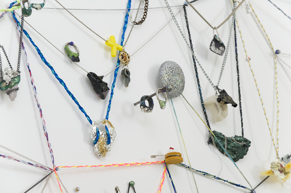
Dan Bell's diagonal cross section of angora aurora, 365 split crumbs at Utopian Slumps as part of the Impossible Objects I exhibition considers the nature of mementos. It is a web of necklaces, like diary entries, that reveals a little something of what has or will happen on each necklace day of the year. Each necklace has a pendent dropping down that is strange, sparkly or curious. There are plastic bok-choys and sparkling corn, silver tea pots, marbled plasticine, a little black alarm clock, rust, nuggets, vine leaves and vials of sparkly dust or liquid. Maybe they are the remains of a shaved glittering bouncy ball or a shredded rhinestone tiara. The sparkly nature of many of the objects and the diamond-like pattern they form remind us of what is considered of value in the jewellery industry. However, the crystals and buttons and plastic strawberry shortcake and bob bon novelty rings that hang from these plastic, gold and silver chains tell us also about a different kind of value that with which the individual imbues an object. The work feels like an elaborate charm bracelet that suggests a story behind each of these objects.  The crumb is a small piece of the cake, as the object is a piece of the memory. 


 The web like presentation of these individual pieces denotes the spider catching the flies. While it’s not sinister, it does evoke a sense of these objects becoming essential. So they can stick. So they can stay. So they won’t get lost or stolen we will wear them around our neck. The interconnectedness of the diamonds and triangles also tells us something about handing things on and where they end up. These objects will get passed down or across but will end up somewhere. They will all eventually disintegrate, like the sparkly stuff in the vials. These objects will probably outlive their owners and will come to mean something different with each hand that holds them.


In gestalt psychology, the law of simplicity holds that objects in the environment are seen in a way that makes them appear as simple as possible. The web-like pattern is what we initially see. When however, we get up close we see the complexity and range of objects within this pattern. This tells us something of how these laws of simplicity (in terms of how we perceive the world visually) can act as a metaphor for how we see the world emotionally. The life and meaning of objects seems to have a simple order of function and disposal but in actual fact the reality of what happens to people’s objects is a much more subjective and complicated. The objects come to represent a part of the person. When a necklace is being worn it has the shape of the neck and decollete; when it is taken off and set down it becomes a clump. The way they are displayed shows the path of least resistance in terms of a gravitational v shape that is harmonious to the eye. The pendent that has lived around a neck can no longer be viewed in terms of its use, function or value.  It will come to symbolise an aspect of the wearer. 


The pendent in jewellery often acts as a symbol of something that can’t be represented physically or literally. They are used as lucky charms, subculture signs or tokens of endless love. They are a symbol of belonging to a gang or a faith. In each case the wearer tells the world that there is more to them than just the lone individual. They are part of something bigger. Like the chains that the pendants are attached to, the individual declares himself linked into a greater whole. Bell’s sparkling array of kitsch and crystals playfully celebrates the diverse and absurd lengths will we go to to find ourselves a part of something bigger.

Bell’s work reminds me of the gifts Boo Radley leaves Scout and Jem Finch in their tree in To Kill a Mockingbird. The older Scout reflects at the end of her story ‘Neighbours bring food with death, and flowers with sickness, and little things in between. Boo was our neighbour. He gave us two soap dolls, a broken watch and chain, a knife, and our lives.’ That objects have sentimental attachment gives them a value beyond their use. We keep them as a direct and physical link to the time and the person they remind us of. Although it is sometimes clear that by their very presence that that time is over and that person is gone.

Bell makes us consider the objects we choose to keep in our lives. These seemingly meaningless objects that come in and out of life can become talismans of identities and stories. Bell gives these crumbs the potential to be sentimental. 

 Anna

Thursday, July 7, 2011

The Structure in the Falling


Naomi Schwartz’s works in her exhibition The Structure in the Falling, at the City Library, evoke the sense of comfort we derive from memories. These works of ink and collage seem like swatches of textures, shape, and fabrics that are often all that remain in memories of fleeting contentment. It’s a mother’s blouse or a quilt in the car, the lining of a handbag or the wallpaper at a holiday house that you followed with your fingers as you went to sleep. These abstract collages are layered like mind associations that hide and disclose fragments of stories.


There are several works titled Whose sleeves?. These works were inspired by the rich depiction of kimonos on late 16th century Japanese screens, Tagasode. In the screens kimonos are rendered in a natural state between clean and dirty draped over the structure itself; a trompe l'oeil of living. In Schwartz’s work the viewer is asked to imagine “Whose sleeves?”—to whom does each of these objects belong. While they seem so abstract and geometric, not wrapped around their owner, they still can communicate so much of their owner’s identity and personality. The clothes, like the screen, both hide and reveal. 


Schwartz’s work also takes on the abstract form of shapes and structures that are like garments cut from a pattern before it is sewn. They are like the hazy, curved and layered memories an adult might have of themselves as a child. The curved forms of fabric like patterns of stripes, checks, pink circles on orange and buds about to bloom, suggest a woman whose shoulder you remember well. They are like the memory of falling asleep on a cotton sun dress lap. It’s the vanilla smell of Shalimar perfume. They take you to the ridges of a beautiful bottle on the dresser or a swish of fabric before a dinner dance and a pile of dry-cleaning and after dinner mint wrappers in the morning. 


Ropes and knots are a dramatic motif in these artworks. They evoke notions of how memory is contained and released. It as though memories can become entwined and knotted. They are like thickly twisted braided fibres that can be made stronger with repetition; or as in Schwartz’s work – split and frayed. The unravelling or splitting of the tightly wound ropes of memory and consciousness, reveal, as in the Split Ropes piece, textured and colourful layers of beauty and intrigue. Between the split ropes are leaves, caves, diamonds and dandelions. The split rope acts compositionally almost like the curtains opening on a proscenium arch to a backdrop of a Russian ballet.  As an audience we wonder what will emerge from the cave. 


Schwartz’s work reveals a tension between what is tightly woven, neat and contained and what is loose, unravelled and falling. It is this contrast, like the unravelling of tightly plaited hair for romantic escapes down towers that creates a sense of drama and narrative in the series. In works such as In Under the Shadow, Bundle and Sleep there is a pillowy soft comfort in the artwork that is like a bed or nest. They are warm, safe spaces that protect and hide. These seem like the places one would stop and enjoy.  The sharp angular forms throughout the work contrast with these billowy fabric forms to suggest the momentary nature of contentment.


The title piece of the show, The Structure in the Falling  is a work of dark bulging ink shaped crosses. The paradoxical notion of a structure in falling denotes a reason in chaos, or a necessity in letting go of some notion of control, order or direction. The thick short crosses, like birds, planes or flailing falling figures have a rounded cushioning form. It seems that one may only find these places of comfort depicted in the collages, when willing to embrace the ambivalence of the metaphor of falling. 


Throughout this work, there seems a sense of joy in the act of unravelling and remembering. There is warmth that makes reminiscence seem comforting rather than confronting. The sense of cushioned landings encourages courage. We are reminded of places in our memory we were caught, held and protected. 

The Structure in the Falling at Melbourne City Library

Anna


Monday, June 27, 2011

Without Words


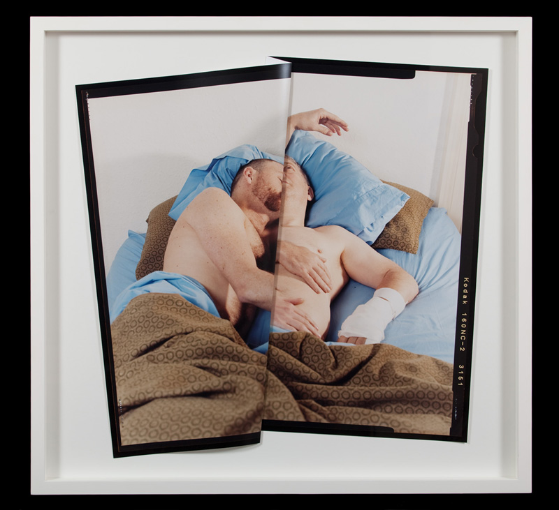
Paul Knight’s works in the exhibition Without Words, curated by Kyla McFarlane, at Centre of Contemporary Photography, are photographs of couples embracing in bed. One member of each couple always has one eye open while the other sleeps. The photographs have a deep fold in the middle of the figures that feels like the crisp turned over sheet in a hotel room. This deep and precise fold contrasts the creamy crinkles of sexed up sheets and flesh. The fold has the effect of making the two figures seem anatomically one. The photographs are light and bright with details of wrinkles, hair and skin pores conveying a visceral sense of reality. There is a clear sense it is morning in these photos. These couples will not be able to stay like this for long, as the person with the eye open seems to know. These works depict an intimacy that is tender and familiar. They show a comfortable state of togetherness that will not require any awkward language about the state of their relationship when they wake.

However, the fold in the photo acts as a dark void. It suggests that moments in relationships that no longer have a need for words are as deep and relaxing and as comfortable as sleep.  In John Donne’s Song (circa 1600) a poem about leaving a lover for a time and trying to convince her not to worry about him—he concludes by saying:

But think that we
Are but turned aside to sleep;
They who one another keep
Alive, ne’er parted be.

Donne and Knight both allude to the solitary nature of sleep. Even when we sleep beside someone, we are in a state of internal isolation. The void created by the crease in Knight’s work suggests the depth of the individual’s unconscious that draws the two together in the first place.  It keeps them separate not only in sleep, but as individuals that don’t function as some sort of morphed unit once together. The couple who, as Donne says, ‘one another keep Alive’ must separate from each other in order to function in the world outside the bed. Though awake, they will need each other, be conscious and appreciative of each other in a way that they can’t be in sleep. It seems the member of each couple with their eye open might appreciate this. Though their dry stare to the ceiling or camera tells us they don’t need to like it and are perhaps envious of their partners deep comfort and sleepy solitude.


However, the crease in the photographs is unsettling.  The part we can’t see makes us curious of a “something missing” in this relationship. So while we might say it’s simply the parts that are unknowable of each other, it still doesn’t quell our desire as the viewer to iron it out. Make it more like the album cover for the soundtrack to Franco Zeffirelli's version of Romeo and Juliet. In psychoanalysis, language is used as the “talking cure”; words open up associations and understandings. The crease seems to imply that perhaps the closer and more comfortable these people become, the less they need to speak.  But things that maybe should be said, get lost down the same crevice that binds them. They risk seeing their partner as perhaps an extension of themselves rather than an individual. Freud writes ‘At the height of being in love the boundary between the ego and the object threaten to melt away’. If too much is left unsaid, it falls down the comfort crack. The deep and dark void becomes a form of waking sleep.

The viewer gazes at this scene with a self-conscious fascination of watching a moment that is intensely private. John Donne in The Sun Rising (circa 1600) admonishes the sun as a ‘saucy pedantic wretch’, who wakes up sleeping lovers. Like the sun in the poem, the viewer and photographer are an outside world that see the loving couple and speculate on the creases in their relationship.  The gaze of the viewer objectifies the couple as perhaps generic types; the old couple, the gay couple, the young couple, to differentiate the untitled works in our mind. So we get a sense that they have woken not only into the arms of a lover who they are close, connected but not co-joined; but also in front of a world of people like me who start finding words and categories for them “old”, “young”, “gay”, ”hairy”, “straight”, “male”, “female”. 

 
The crease, while seemingly menacing, could be about what can remain hidden. Perhaps it is hidden to protect something even more private then this morning moment. It can stay comfortably hidden between couples. It has to stay hidden from the taxonomic tendencies of the viewer. It may even stay hidden to the individual. They will tuck themselves in it at night and iron it out to face the world in the morning.

at CCP

Anna